Web Design
The Global Network of internet & Society research centers
Overview
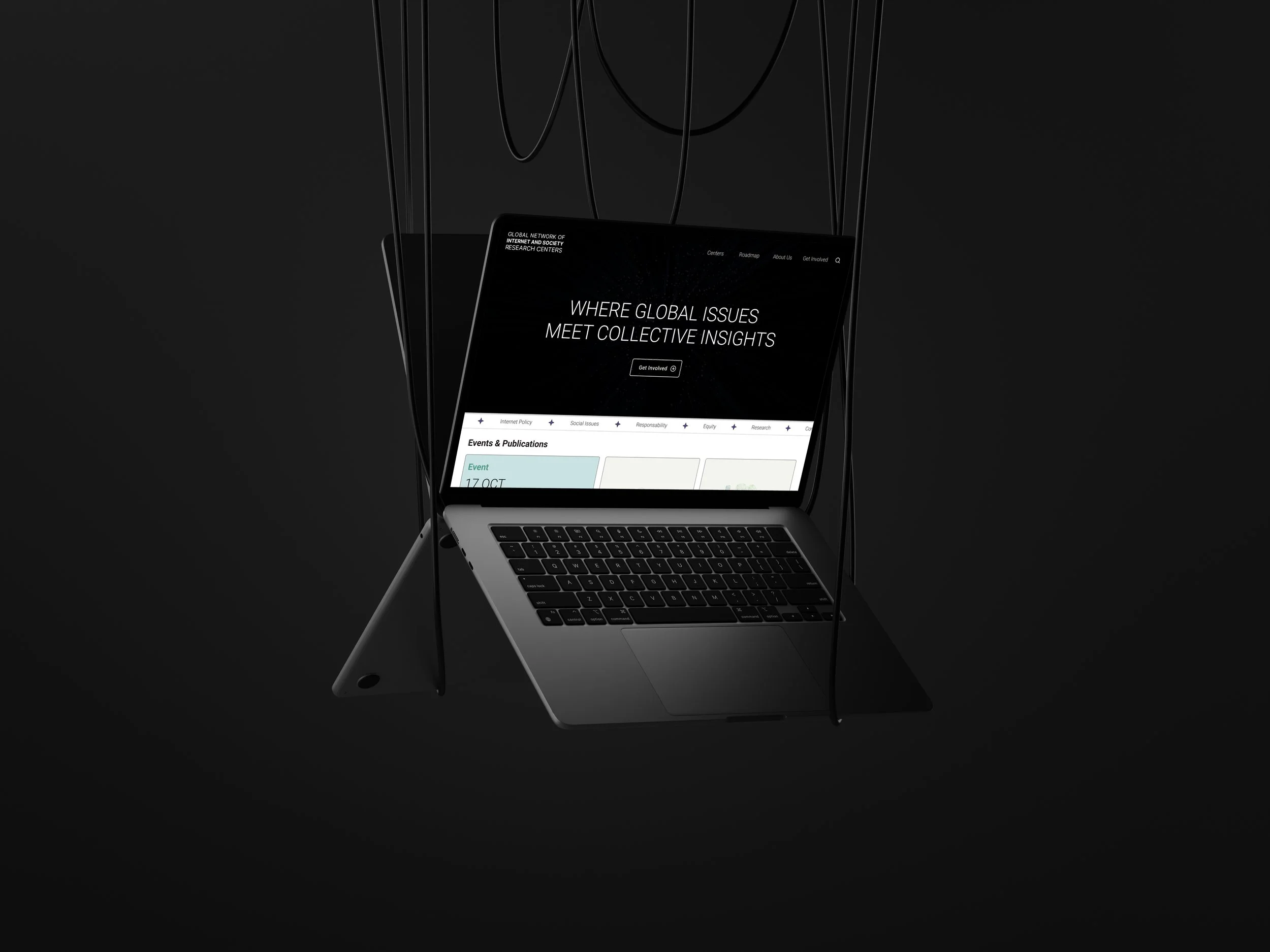
A comprehensive redesign of the Global Network of Centers (NoC) platform. I transformed a cluttered, "old-school blog" style website into a high-level Academic-Modern digital tool that prioritizes global research connectivity and premium readability.
The Challenge
The original site suffered from a crisis of both identity and functionality: Outdated Aesthetic: A design that felt like a legacy blog, misaligned with the prestige of a network affiliated with Harvard’s Berkman Klein Center. Walls of Text: Endless blocks of content and a lack of visual hierarchy made information nearly impossible to digest. "Dead" Elements: Broken map plugins and non-functional features that eroded professional credibility. Fragmented Navigation: The inability to move fluidly between different centers blocked the network’s core mission: collaboration.

Process & Strategy
Audit & Cleanup: Stripped away technical "noise" (broken plugins) and visual clutter to start with a clean slate. Editorial Design Benchmarking: Analyzed modern academic publications and cutting-edge research platforms to define a new "Academic-Modern" visual language. Network Architecture: Redesigned the navigation flow centered on the interconnectivity of the network’s nodes (research centers).

Key Design Decisions
The fundamental shift was moving from a disorganized repository to an Academic-Modern visual identity. Total Graphic Evolution: Editorial Style: Implemented a clean layout with generous white space to allow complex content to breathe. High-Impact Typography: Established a hierarchical system (based on Roboto) to ensure legibility for dense papers and articles. Professional Palette: Used sober tones with strategic accents to guide user action without losing institutional weight. Ending the "Massive Blog" Feel: Replaced long paragraphs with modular components, cards, and grids, allowing for quick information scanning. Center-to-Center Connectivity: Developed a dynamic, functional directory, replacing broken maps with an intuitive interface for navigating between institutions.

The Solution
A responsive platform that balances academic prestige with technological agility: Collaboration Interface: An ecosystem where jumping from one research center to another is seamless, fostering global synergy. Clean & Functional Design: Eliminated visual distractions to put the spotlight on data and research. Curated User Experience: A logical flow that guides the user from general network context to specific center details effortlessly.

Results & Impact
Reinforced Prestige: A visual identity now aligned with the importance of its members and institutional affiliations. Information Efficiency: Drastically reduced cognitive load by presenting complex research in a segmented, clear format. Restored Functionality: A 100% operational site, free of dead elements and optimized for real-world institutional connection.

Key Take Away
This project proves that visual design is not just "decoration"—it is a credibility tool. By pivoting from a cluttered blog style to a modern academic aesthetic, we didn't just improve usability; we restored the network's institutional value, turning the website into a true bridge for global collaboration.